KDDI Brand Book
![]()
Pagetop


Mid-Term Management Strategy
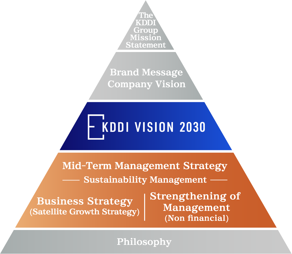
We will explain the structure of the overall framework that runs through the corporate philosophy, brand message, vision, KDDI VISION 2030, mid-term management strategy (business strategy and strengthening of management foundations), and philosophy, as well as the positioning of the brand message within that framework.

Brand Message
The thoughts behind each brand are expressed through videos, slogans, and statements.
-
Corporate brand
-
Business brand(For Corporations)
-
Business brand(For Individuals)
-
Service brand(For Corporations)

-
Service brand(For Individuals)
Company Vision
Our company vision describes our corporate image to make that brand message a reality.
KDDI aims to be "A company that inspires passionate challenges", and we will focus on three key challenges.


